
TQ 2 ME
- Liberty Feist
- May 12, 2021
- 3 min read

Updated: Sep 8, 2021
LOCATION LOCATION LOCATION — a project in progress
Torquay (TQ2) is the place I have called home for the majority of my 29 years… I had this idea one morning, and ran into my studio half-dressed (what’s new?) to scribble down the thoughts in my journal before they were lost.
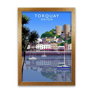
I want to produce a sort of local poster, capturing my favourite parts of various areas – and I know this has been done (brilliantly) already by many wonderful women in the South West – but not with photographs, and not with a neon palette, and not all the things I like in a poster – certainly not for Devon anyway. I tried to find it, and I couldn’t, which is why I think it’s important to produce it. Because I feel like someone once said something like: if you can’t find the artwork that speaks to you, go out and create it!
Below are some of the examples of what’s already out there… (we have quite a few Hillfolk and Becky Bettersworth posters in our house actually)


So I jumped on Photoshop, and started to have a fiddle around with this idea using a few photos picked out of my phone’s archive.
I think with the translucent neons, I’m trying to replicate something that I love in the tactile quality of screenprints, but this doesn’t quite come across in the experiments below. I think a lot of the punch of the neons is lost in the act of making it translucent. I so wish I’d done a screenprinting course while I was at uni! It’s definitely something I want to do as soon as I can, it would be so nice for this project… but I will carry on working with my existing skills and tools for now.
PHOTOSHOP PLAY SESSION #1

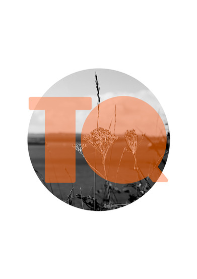


You can sort of see the idea evolving through the images as I played around with different settings and photos… I much prefer the end three, even though they don’t fit into the NEON brief, but they appeal to me.
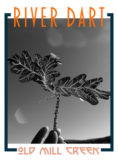
I went back and began to experiment in other styles. I felt like first batch of poster ideas, weren’t quite quirky or bold enough for my taste, I also wanted them to feel a little more like a modern take on the old style posters, than simply an art print. I seem to have this obsession with a circle cut-out of a photo on a white page… but I think I need to get passed that ideal for this project, fill more of the page, make more marks – be bolder!
again you can see the ideas evolve between saves…
PHOTOSHOP PLAY SESSION #2


I want to provoke interest, and encourage nostalgia…
I DON’T WANT TO MAKE ‘NICE & PRETTY’ – I WANT TO MAKE A STATEMENT

I flirted with the idea of just going for a very honest local’s point-of-view for living in a tourist town… created half in jest, half in exhaustion… but I don’t know if I want to go down a road that may end up being a tad meme-esque.

Perhaps at some point, if it works out organically – for now the idea will remain an idea.
(don’t worry, these aren’t the finals!)
The kind of vibe I am imagining and attempting to translate to the page, is something worthy of the Love Frankie aesthetic & their sort of clientele’s taste… to feature in the kind of home I want to have (again) one day.
I will make a video on this subject & project soon – I’ve been busy with home improvements & self-care… and plan to spend another week or so taking things easy, while I restore and rebalance under the the new moon in Taurus.
FEEDBACK:
I really really want/ need/ value your feedback on this project as it evolves, I’ve not shot for it yet but I’m starting to plan which visuals / what sort of views to look out for and any fun tricks to play with.
so come at me with your opinions and feedback please!
what locations do you want to see
do you want to see straight landscapes/ landmarks/ monuments OR more ambiguous visuals such as leaves and less well known buildings etc…
get quirky or keep it simple
email / message / dm me on any platform to let me know what you think of it so far.


Comments