
#30BY30 WEEK ONE
- Liberty Feist
- Jan 16, 2022
- 6 min read

Updated: Jan 18, 2022

Oh hey, a week's gone by already!
In the first seven days, I have started four projects - though, I've not really stuck to the initial idea of trying to make the majority of the mini projects a one-day thing. Oh well, I'm certainly not surprised by that.
By far, the one that's filled me with the most joy is project #3: the artbook... and that's one I'll absolutely be returning to soon to delve a little deeper and make some more. Thank you so much to everyone who's following along on my stories (I see you) and who have messaged - I really value your feedback, support and suggestions! Keep it coming.
PROJECT #1: SODIUM CARBONATE
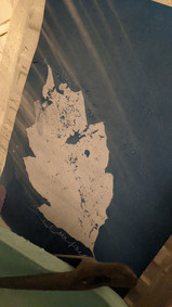
Okay, I could have spent more time on this, or potentially even bothered to follow the guidance. Obviously not though. There's still room to work on this, as it's potentially a pretty cool idea - so the powder Sodium Carbonate when made into a solution with water works in two ways in this mini project.
Firstly, you can use the solution to make 'skeleton leaves' if you boil it (I didn't boil it)... this should have been really cool - so there would just be the 'bones' of the leaf left, thus making much sharper and quicker/easier to expose leaf cyanotypes.
Secondly, when applied to a processed cyanotype, the solution breaks down the blue pigment in the paper and starts to turn it purple and then yellow... which is pretty cool! I had an issue on this first piece because I wanted to change some of the colour but not all of it, so I was squidging it on using a sauce bottle, and trying to quickly wash it off before it altered anywhere I didn't want it. Not easy, but for a first try, I'm pleased with the potential.
I think I'll have one more quick go at this; process the leaves properly, and then take a little more time on processing the cyanotypes to get something I'm happy with. All in all, a good experiment!
PROJECT STATUS: OPEN


PROJECT #2: PAINTING WITH CYAN
TAKE ONE... Underwhelming.
Inspired by fellow cyanotype artists such as Ellie, I wanted to try my hand at painting with the cyanotype sensitiser to create the artwork before the magic of the UV booth... so laying down the yellow which would become blue.
I'd made a few fennel cards over the autumn where I'd very freely and haphazardly coated the paper with sensitiser, but this meant that once exposed and processed, I had these different tones of blue from where the brush had swished over it a second time, or suddenly sploshed a little extra on a final swish than over the whole - so you could see brushstrokes... combined with the fennel and scattered pollen, it made for a beautiful almost galaxyesque visual. So it wasn't about the exposure time, or the amount of light blocked, it was a predetermined light & dark, made by the brush and this magical yellow solution.
I decided to do a painting of something, and one just abstract - but got a little big for my boots. I tried to paint a whole seaside scene, which actually looked okay during the first wash and the vinegar rinse, but once the print hit the hydrogen peroxide, all tones magically went the same dark navy and the magic was gone. I didn't actually really know how to do the layers, which to paint first, and I hadn't sketched it out yet... but I tried using a blocking liquid to keep the white areas white (definitely smelt out of date) which sort of worked. I think also I'd opted for a very thick cotton rag, which possibly was too fancy for this project, and I may have had better luck with a watercolour page or something smoother.
With the 'abstract' piece, I just threw as much as I could at the page, using any tool that took my fancy just to test things - incl, bubble wrap and even my drink (lemon squash).
fucked it.
Definitely need to have another go at this one, but not overthinking it, keeping the shapes and layers simple, allowing it to dry naturally between layers.


TAKE TWO... I couldn't leave it as it was, so I simplified, set out with no fixed plan and made these two. i love flowers, and especially doodling them, so I doodled with my little paintbrush and delicately built up a yellowy coating ready to hit the sunbeds. And they turned out okay! I'm still learning about how much is too much - some of the bits I tried to make darker with thicker layers of sensitiser, then decided to sort of jellify and therefore blocked the light reaching the initial layers and so it came out very pale - you can see this most in the writing, I kept dropping on extra bits of the yellow liquid and watching them bleed along the pathway of the word, I enjoyed it so much that I overdid it. Another lesson learnt!
Where this worked really well though, is on the dotted flowerheads, where the sensitiser was too thick/not thoroughly dry before exposure (I'm impatient!) the middles are much paler where if this was say a watercolour, it would be the darkest once dry. Ironically, I'd regretted not leaving the text white but didn't want to use any extra props, so if I'd known that overloading would result in a white area, I would have overloaded the whole line of text to make a fully white "grow".
I like to include lots of photos of the process, because it's difficult to articulate the process, and how much of it is chance and unpredictable... you're never really sure how much will wash away, and what will stay.
PROJECT STATUS: CLOSED


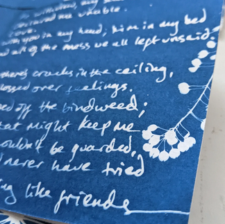
PROJECT #3: ARTBOOK
My little heart beats with pride, she feels heard.
Thrilled with this one, I've been meaning to experiment with some artbooks using cyanotype for a while now, I just wasn't quite sure how, and I overthought it so much that I inevitable abandoned/buried the idea every time. But I finally did it, or at least, started it.
So the idea is, I made these little books as a test for a project at uni (they were so tiny!) using scans/photographs of A3 artworks from my art therapy self-portraiture project. The artworks were generally all nude photographs, printed very basically on the library repro printer, which I had then embellished in a mix of printmaking methods, very raw and expressive, featuring a lot of writing and drawing as well as mark making generally. I loved them. They really summed up a lot of the things I was going through at a difficult time in my life... it made them beautiful, approachable, and well almost manageable. These palm-size books told a story of loss, pain, and acceptance.
In the uni project, I tried very hard consciously and sometimes unconsciously to disguise what I had written - I was doing it for the process, the catharsis, the release... I didn't need (or really want) anyone seeing what it was I had written, especially as one of the major topics wasn't just my story to tell and I was protecting the other party... I don't need to do that anymore. This project, I'm not hiding the words - I'm framing them, putting them centre stage, spotlighted.
I love poetry books... but I think my favourite (for style and approach rather than content) is Rupi Kuar's - a friend recommended her book to me at a time when I had to make a lot of big decisions, and listen to my heart a little more. I've wanted to design my own, in my own style for a while now, having written poetry and lyrics for about 15 years, but never really 'put them out there'. I thought of designing this digitally, or having it all hand drawn but then recently it occurred to me that yeah, I could do all this in cyanotype - seamlessly combining handwritten poems with flowers, drawings, photographs, and I guess even some printed words too. And for it to be BLUE the colour of the throat chakra, the colour associated with voice and self-expression, the colour most often linked to sadness, but also to nobility and holiness, the sky, the sea... blue, is such a complex beauty.
[someone remind me to add a whole page about the importance of blue]
So here are the first 10 pages that may or may not make it into my first fully cyanotyped artbook / poetry book. Drawings, flowers, words from the heart; a cathartic and honest process, art therapy for a lover of blue. I've made mini artbooks before, I've done art therapy projects before, but this is my show, my story, and this time it's personal - an open book, nothing to hide, no one to protect but myself. I think a lot of things I've been passionate about have led up to this and amalgamated to become something quite magical.
I just need to make the rest now, and figure out how I want to assemble & bind the book... it's obviously going to have some gold additions! I think you can probably tell, by how much I've written about it, that I'm so passionate about this.
PROJECT STATUS: OPEN
side note... would you buy one?


WEEK TWO.... I have a few things in mind, a commission idea which I've been discussing with my sister for a while now and maybe a one-day-challenge may be a good way to focus me in on starting/completing that. I've also opened up prompt suggestions to my followers, and have already received some thought-provoking suggestions.


Comments